I only want to use one colour on my digipak and magazine advert as I want to let the picture do the talking and not to focus on the colour of the font too much. I mainly want a bold colour so that people are able to see it. Here are some ideas:
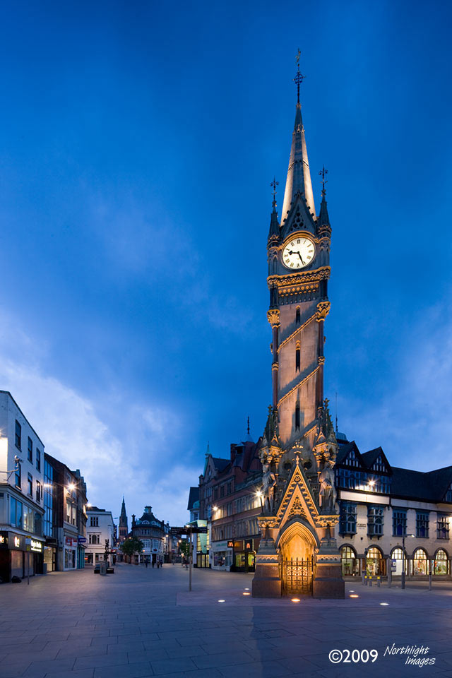
Now that I have decided to use a Lego man for my pictures, I need an interesting locations so that I can take some photos that will look good and fit nicely with my digipak and magazine advert. I am thinking of using Leicester as the location for my photos as it has interesting architectural structures that I can place the Lego man in front of.
After doing some research on fonts used on an album cover of my music genre, I have found these two that I like the look of and are considering using them in my final piece.
I find these picture interesting because I have never seen anything like them before. I could potentially uses a similar picture like this for my Digipak and magazine cover.