Adam, Tarun, Jack, Dino (Matt) - Level 2
All the band need to deadpan the performance (see Adams face). Maybe to drum on first beat. Costume is appropriate, room works, most shots well framed.
Dino always look straight ahead!
Take care to keep order in line up.
We EXPECT level 4!
Singer has to be dead on, really on it and focused.
- black and white works really well
- styling is impeccable
- don't bother with the walk (not essential to the success of the video)
Monday, 24 November 2014


Thursday, 20 November 2014
Tarun's Digipak Research

Image 2: I then started looking at landscapes as an idea to use for the album cover.
Image 3-4: I thought maybe a landscape with a sunset would make a good front cover for the album cover.
Image 5-6: As I was searching for more landscapes I came across these images and I liked the idea of viewing the world from a Lego mans prospective. I found a lot more pictures like this and really liked this idea as I have not seen it before on an album cover.
Image 7: This is my first draft, I used a font that was already on Photoshop as I didn't have time to find one.
Image 8: After receiving my draft feedback I started looking for appropriate fonts that would fit the genre of music I have chosen.
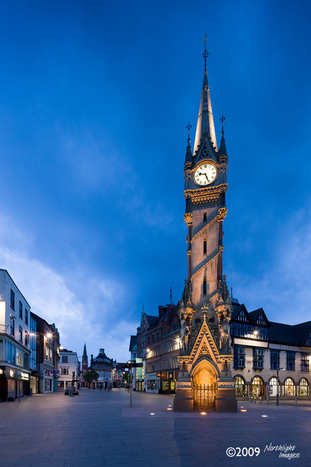
Images 9-11: These are some landmarks within Leicester and I wanted to take pictures of these landmarks with my lego man in the picture.
Images 12-13: These are my pictures when I went into Leicester and took pictures of my Lego man.
Image 14: These are the colours that I used on the album cover. I chose these colours as I wanted a very simple album cover.
Image 15: This is another Draft of my final album cover.
Image 16: This is my final album cover.
Friday, 14 November 2014


Thursday, 13 November 2014
Colour ideas
I only want to use one colour on my digipak and magazine advert as I want to let the picture do the talking and not to focus on the colour of the font too much. I mainly want a bold colour so that people are able to see it. Here are some ideas:


My Pictures
I went to the city centre of Leicester to take my picture for the Digipak and magazine advert. Here are some:


Wednesday, 12 November 2014
Location ideas for photos
Now that I have decided to use a Lego man for my pictures, I need an interesting locations so that I can take some photos that will look good and fit nicely with my digipak and magazine advert. I am thinking of using Leicester as the location for my photos as it has interesting architectural structures that I can place the Lego man in front of.


Fonts that I like the look of
After doing some research on fonts used on an album cover of my music genre, I have found these two that I like the look of and are considering using them in my final piece.

Monday, 10 November 2014
Interesting Pictures that I found for Digipak and magazine advert


I find these picture interesting because I have never seen anything like them before. I could potentially uses a similar picture like this for my Digipak and magazine cover.
Sunday, 9 November 2014


Saturday, 8 November 2014
Front cover idea for Digipak

I feel that this famous Japanese painting would look good as the front cover for my Digipak, this picture looks very simplistic.
Subscribe to:
Comments (Atom)